North Ryde RSL Community Club Announces New Brand

Related
Ken Murray spent 42 years on the Board of the Randwick Labor Club — 38 of those as President. And it all started with a surprise encounter at cricket training.
Club News
Community
Innovation
Leadership
4 minute read
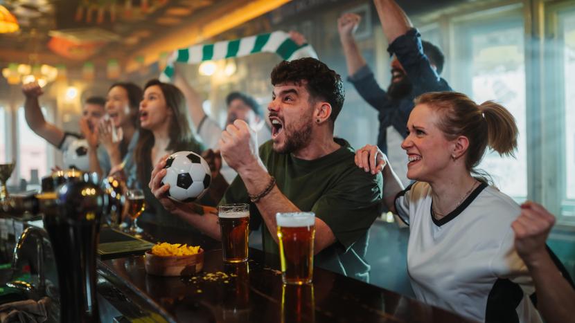
After patrons flocked to clubs around the state for early-morning FIFA World Cup matches, the NSW Government has announced special event extended trading hours for the rest of the year.
Club News
Community
Entertainment
Events
Sport
3 minute read
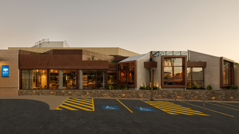
A major renovation has transformed Balgowlah RSL, creating a vibrant alfresco hub that attracts families, locals and long-time members.
Club News
Construction
F&B
3 minute read
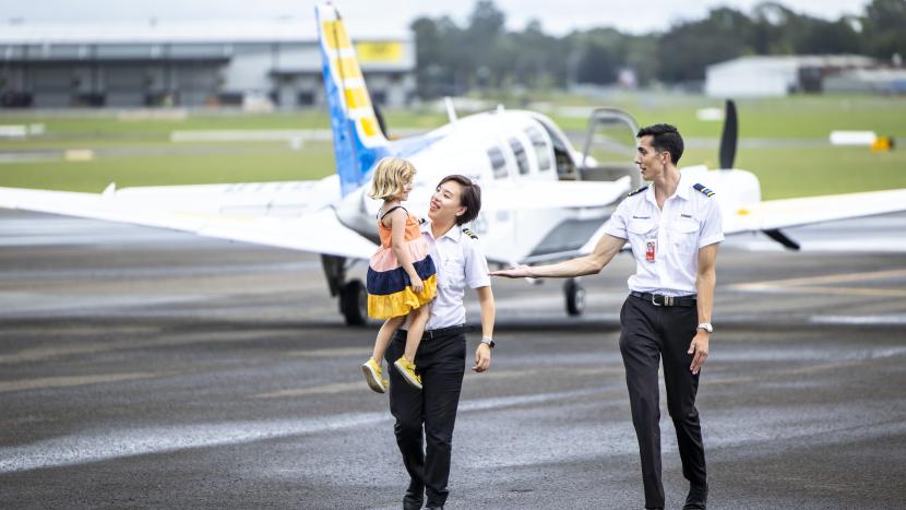
Clubs across the New England Tablelands feature in the latest ClubGrants advertising campaign for their crucial role in connecting regional families with urgent healthcare.
Club News
ClubGRANTS
Community
Emergency Services
Health Care
4 minute read